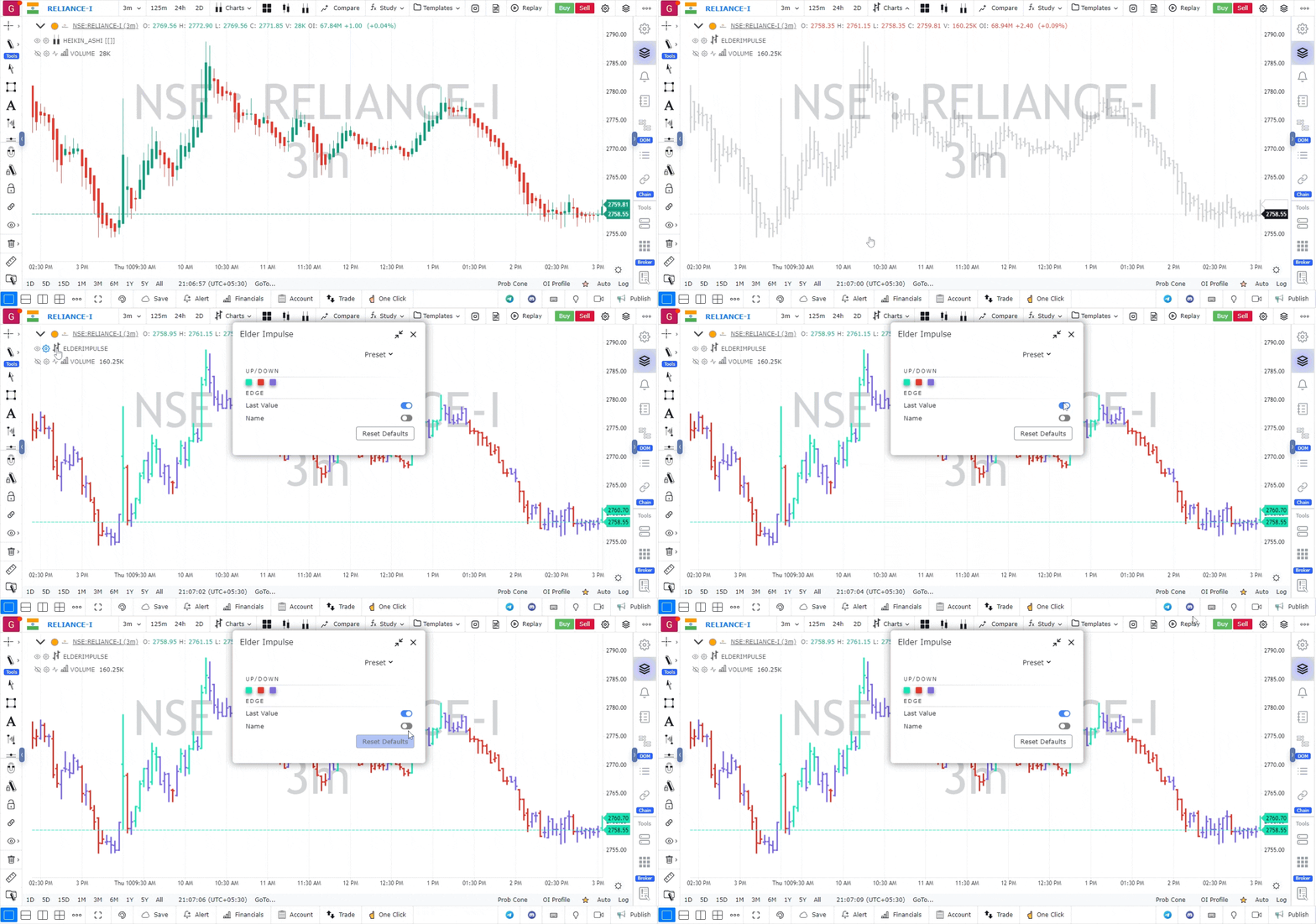
Elder Impulse
General Info
Elder Impuse chart is basically an OHLC chart which uses color coding across bars to reflect bullish and bearish trends. The Elder Impulse System was designed by Alexander Elder and featured in his book, Come Into My Trading Room. According to Elder, “the system identifies inflection points where a trend speeds up or slows down”. The Impulse System is based on two indicators, a 13-day exponential moving average and the MACD-Histogram. The moving average identifies the trend, while the MACD-Histogram measures momentum. As a result, the Impulse System combines trend following and momentum to identify tradable impulses. This unique indicator combination is color coded into the price bars for easy reference.

Calculation
Green Price Bar: (13-period EMA > previous 13-period EMA) and (MACD-Histogram > previous period’s MACD-Histogram)
Red Price Bar: (13-period EMA < previous 13-period EMA) and (MACD-Histogram < previous period’s MACD-Histogram)
Price bars are colored blue when conditions for a Red Price Bar or Green Price Bar are not met. The MACD-Histogram is based on MACD(12,26,9).
Green price bars show that the bulls are in control of both trend and momentum as both the 13-day EMA and MACD-Histogram are rising. A red price bar indicates that the bears have taken control because the 13-day EMA and MACD-Histogram are falling. A blue price bar indicates mixed technical signals, with neither buying nor selling pressure predominating.
Timeframe
The Elder Impulse System can be used across different timeframes, but trading should be in harmony with the bigger trend. Elder recommends setting your trading timeframe and then calling it intermediate; then, multiply this intermediate timeframe by five to get your long-term interval. Traders using daily charts for an intermediate timeframe can simply move to weekly charts for a long-term interval. The choice is not as clear-cut for smaller or longer timeframes. A little judgment is required. Traders using 10-minute charts to chart their “intermediate” timeframe can use 60-minute charts for their “long-term” interval. Investors using weekly charts can base the bigger picture on monthly charts. Once the trading timeframe is decided, chartists can then use the longer timeframe to identify the bigger trend. This can even be accomplished using one chart. Chart 2 shows daily bars with the Elder Impulse System and the 65-day exponential moving average, which is five times the 13-day EMA. The long-term trend is considered up when SPY is above the 65 day EMA or when MACD (1,65,1) is positive.
Again, other methods for determining the weekly trend can be used instead of using the MACD(1,65,1) zero crossover on the daily chart. We will use that technique in this article to simplify the charts and discussion.
Entries and Exits
A buy signal occurs when the long-term trend is deemed bullish and the Elder Impulse System turns bullish on the intermediate term trend. In other words, the weekly chart has to show a clear uptrend in order for a daily buy signal to be valid. Daily buy signals that happen when the weekly chart is not in a clear uptrend are ignored.
A sell signal occurs when the long-term trend is deemed bearish and the Elder Impulse System turns bearish on the intermediate term trend. For example, the weekly chart has to show a clear downtrend in order for a daily sell signal to be valid. Daily sell signals that happen when the weekly chart is not in a clear downtrend are ignored.
In the daily chart above, we are using the MACD(1,65,1) indicator to show us the weekly trend. If it is above zero, the weekly trend is up. If it is below zero, the weekly trend is down. Given that, the first three green arrows on the chart show valid daily buy signals (i.e. new clusters of green daily bars). Note, however, that the first couple of red bars on the chart are NOT valid sell signals in this case because the weekly trend is still positive (according to the MACD we are using). The red arrow shows the first valid sell signal that happens after the weekly trend turns down. Similarly, the weekly trend must turn positive again before valid buy signals are given (as indicated by the last three green arrows on the chart)