Points & Figures
General info
Point & Figure (P&F) charting has a long history and known to be the oldest charting method. Though it is difficult to claim that any one person has invented it, the first reference to P&F came in 1898 from a writer named “Hoyle”. The method is born out of necessity of recording the prices by the floor traders. There are evidences that Charles Dow used to plot the chart with this method then called ‘Book Method’. P&F construction has traveled though various forms and called by several names during its long journey.
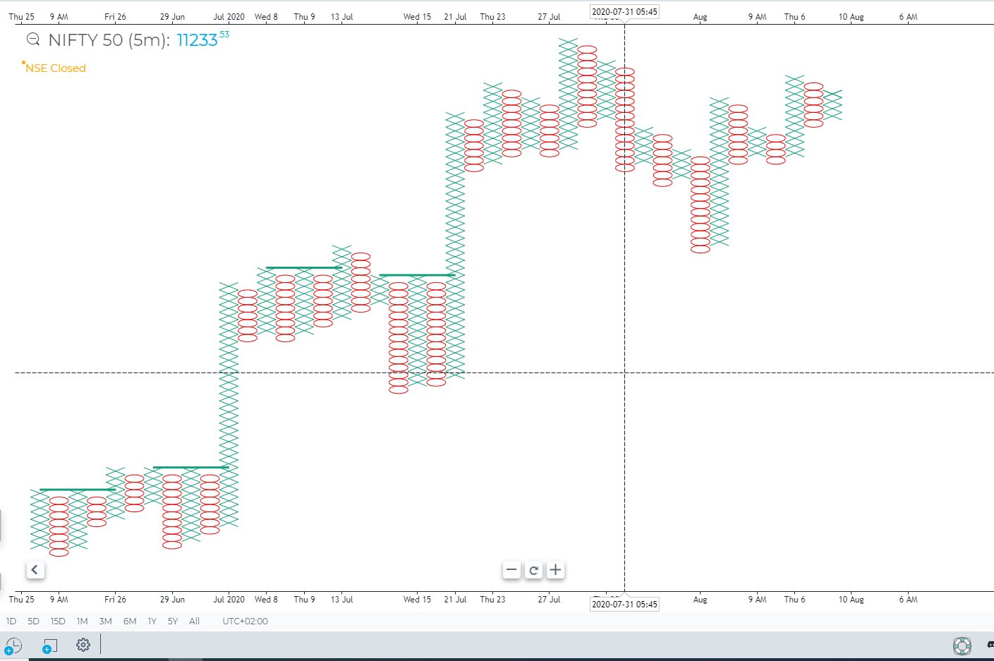
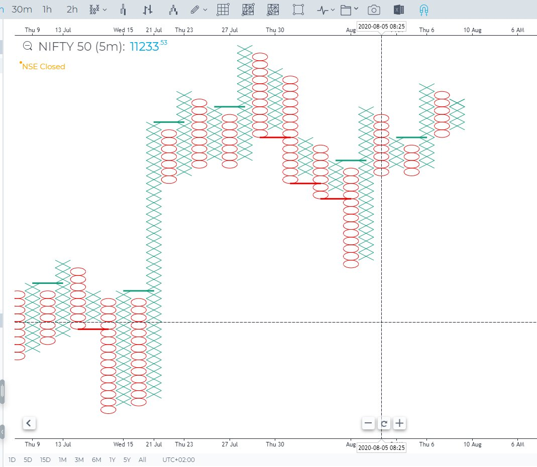
Points & Figures is one of the most popular chart types that allows traders to analyze only the price without time-bound, thereby eliminating market noise. In contrast to the usual candlestick charts, P & F consists of X and O columns, which reflect the rise or fall in prices, respectively. It relies solely on price movements and not time intervals during the creation of the chart. In this way, PnF Charts are similar to Renko, Kagi and Line Break Charts. In a basic understanding of PnF Charts, you can understand that they are comprised of a series of columns made from either X’s or O’s. X columns represent rising prices, while columns consisting of O’s denote falling prices. Point and Figure Charts were originally popular in the early 1900s, before the prominence of computer based charting. They were a way for technical analysts to chart large amounts of data in a short period of time. With the rise of computers, PnF Charts fell out of favor for quite a while. However, more recently, PnF Charts are once again gaining popularity. Overall, there is a renewed interest in “noise filtering” charts, which solely focus on price movements.
General view of Points & Figures chart type
P&F charts provide a unique look at price action that has several advantages:
- Filter insignificant price movements and noise
- Focus on important price movements
- Determine support and resistance levels
- Identify trends and reversal points
- Remove the time aspect from the analysis process
The X’s and O’s that make up each column occupy a space called the Box Size. The box size is a user determined value. When price moves enough in the same direction as the current column, a new X or O is added to that column. When price closes far enough away in the opposite direction, a new column begins with either an X or an O (The opposite of the previous column). The amount that price must move is determined by the reversal distance. This value is created by multiplying the box size by another user defined value, the Reversal Amount. The reversal amount is the number of bricks price must move in order for a new letter to be drawn or a new column to be created. Therefore if the box size is set to 1 (3 in order for a new letter to be added to the chart.
There are two rules regarding the letters and columns.
- Each column has to be either X’s or O’s. There can never be two different letters in the same column.
- X columns and O columns will always alternate. You will never see two X columns side by side and vice versa.
Box types
There are four different types of lines that can be drawn within a PnF Chart.
- Up Bars — Form during an uptrend.
- Down Bars — Form during a downtrend.
- Projected Up Bars — During an intraday timeframe, a potential up line that would form based on current price (before actual closing price is set).
- Projected Down Bars — During an intraday timeframe, a potential down line that would form based on current price (before actual closing price is set).
Box calculation methods
There are two different methods for calculating reversal distance:
Auto or Average True Range (ATR)
- Uses the values generated by the Average True Range (ATR) indicator. The ATR is used to filter out the normal noise or volatility of a financial instrument. The ATR method “automatically” determines a good reversal distance. It calculates what the ATR value would be in a regular candlestick chart and then makes this value the reversal distance.
Fixed
- Uses a user-pre-defined absolute value for the box size and reversal amount. New boxes are only created when price movement is larger than the pre-determined reversal amount. The upside to this method is that it is very straightforward and it is easy to anticipate when and where new boxes will form. The downside is that selecting the correct box size for a specific instrument will take some experimentation.
% Price
- Uses an % increase or decrease in price to determine the box size. Since it is a % normalized hence the aboslute value of the price increase and decrease will vary at every candle level. This is an extremely powerful setup to filter out noise
How is the Point & Figure chart built?
Main parameters for plotting P & F chart
The plotting of P & F chart depends on several basic parameters:
Box size
- Determines the price range (the number of ticks) for X-Columns or O-Columns. Each X and O occupies an area called Box, the size of which is determined by the Box Size parameter. No Xs or Os are displayed if prices rise or fall by an amount that is less than the box size.
Reversal
- A parameter that indicates the number of Box Sizes that the price should go in the opposite direction to begin a new column. A new column, therefore, signals a change in the price trend.
To build a chart, you can use two sources:
Classic
- Classic, which uses only the closing price (last price) to plot the chart.
High/Low
- High / Low is based on High and Low prices.
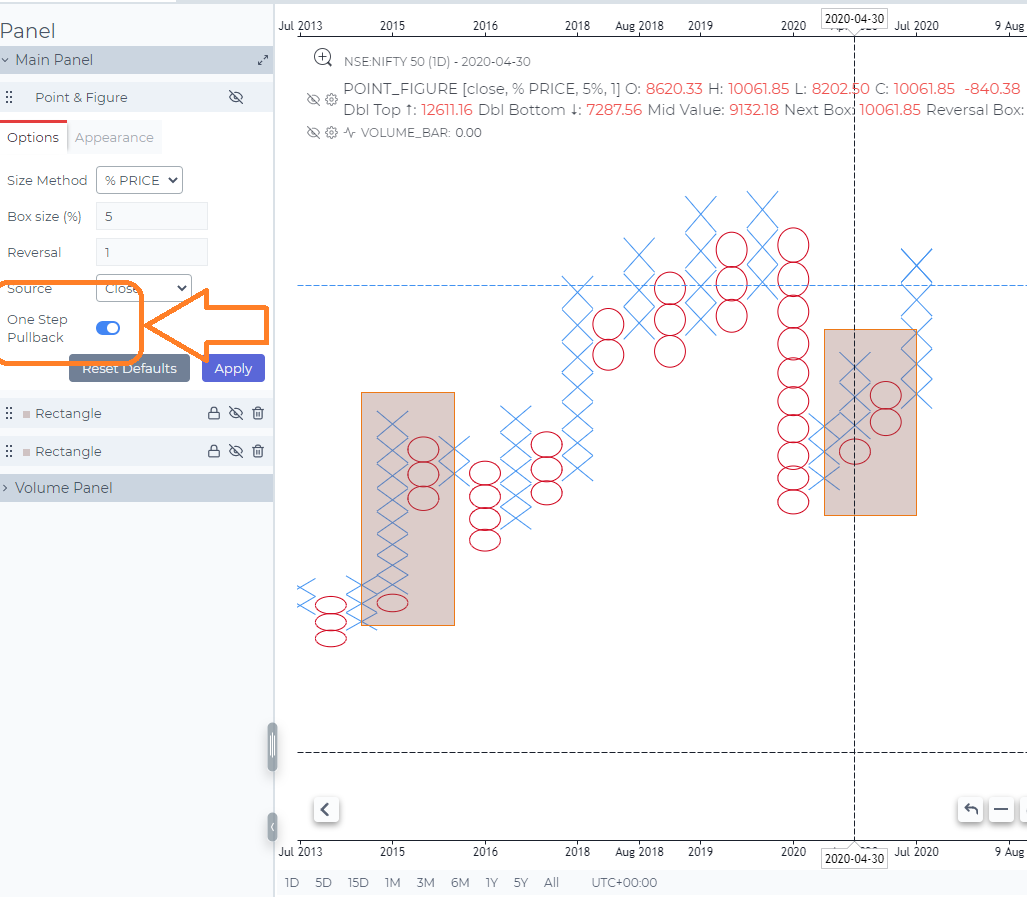
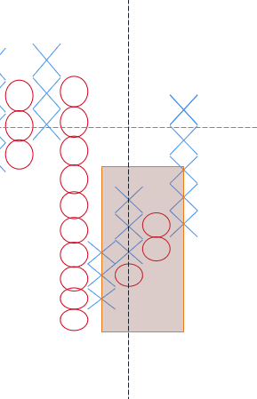
One Step Pullback
One Step Pullback is now available on Point and Figure charts. To use it, go to the the chart settings, select P&F style, reverse amount = 1, and enable the new One Step Back Building feature. A feature like this is an important component of the Wyckoff chart analysis method
If the price unfolds and changes by 1 box size (1), and then again unfolds and changes by at least 1 box size (2), then new figures are shown in the same column until the next turn. Now, with the one step back building feature, the X and O can be combined into one column
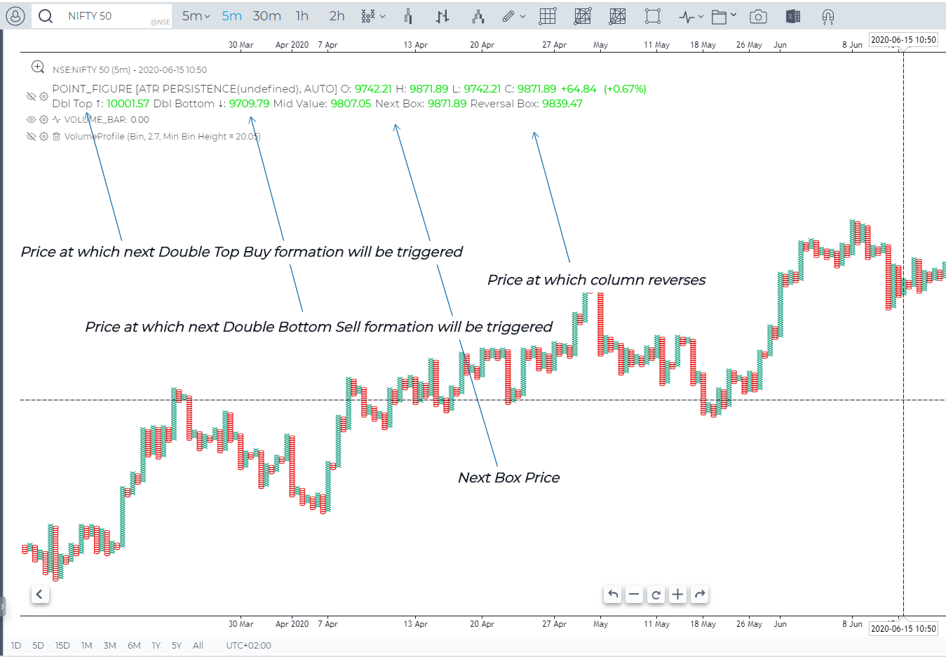
Chart Commentary/Tooltip
Enhanced Commentary now available on Point & Figure charts. Important levels are marked in the Chart legend
- Double Bottom Sell
- Double Top Buy
- Next Box Price
- Reversal Box Price
Uses of Point and Figure Charts
As with the other previously mentioned noise filtering charts, Point and Figure Charts are gaining in popularity because they do not factor in time or minor, naturally occurring price movements. Proponents of these types of charts believe that this characteristic makes it easier for users to spot trends and anticipate future price movements. For example, Point and Figure charts are great for visualizing trend lines, support and resistance levels and breakouts.
Trend Lines — Point and Figure Charts were originally drawn by hand on graph paper. Because of their nature, 45 degree(ish) trend lines can form naturally. These lines are a good way to identify overall trends, which can be beneficial on their own as well as with additional tools or indicators.
Support and Resistance Levels — frequently, when using Point and Figure Charts, trading ranges appear when bars are generated between levels of support and resistance.
Breakouts — breakouts occur when boxes begin to generate in a defined direction after a period of trading within a support and resistance bound trading range.
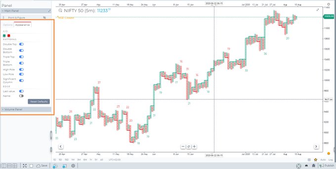
PnF Patterns
Point and Figure Charts in GoCharting come with built-in Bullish and Bearish pattern recognition
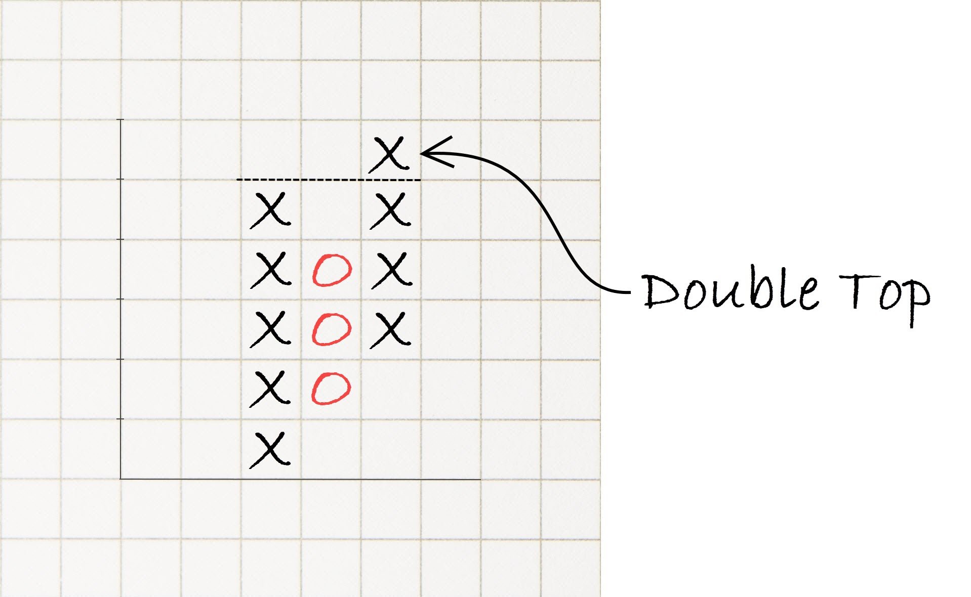
- Double Top
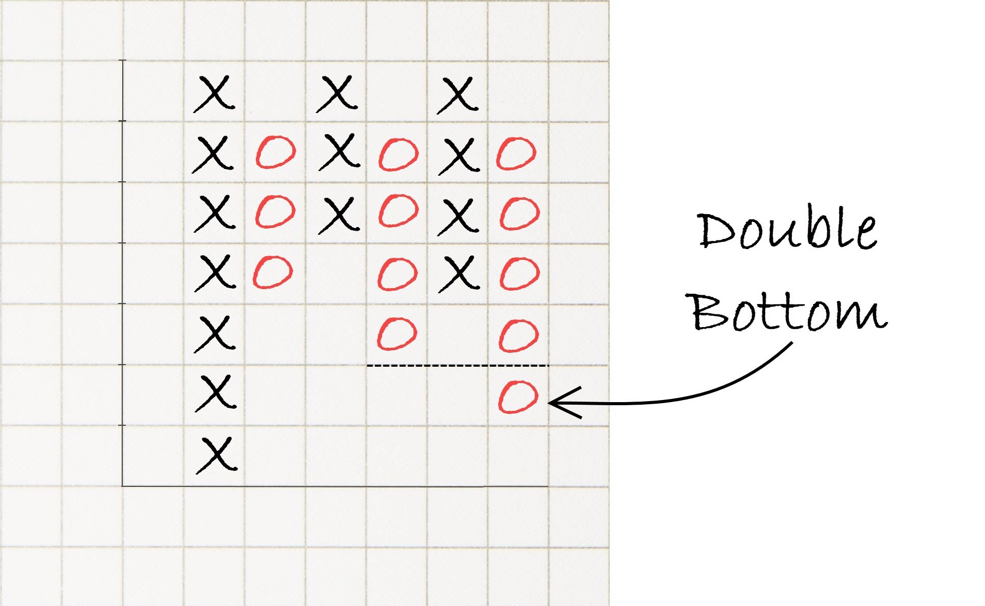
- Double Bottom
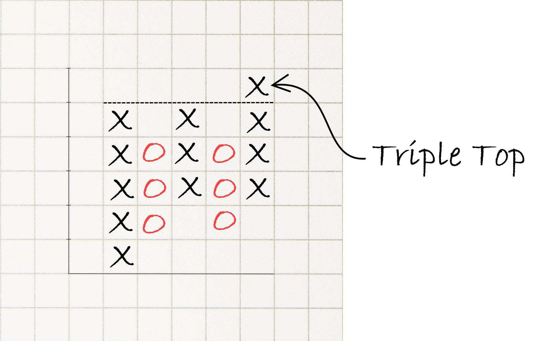
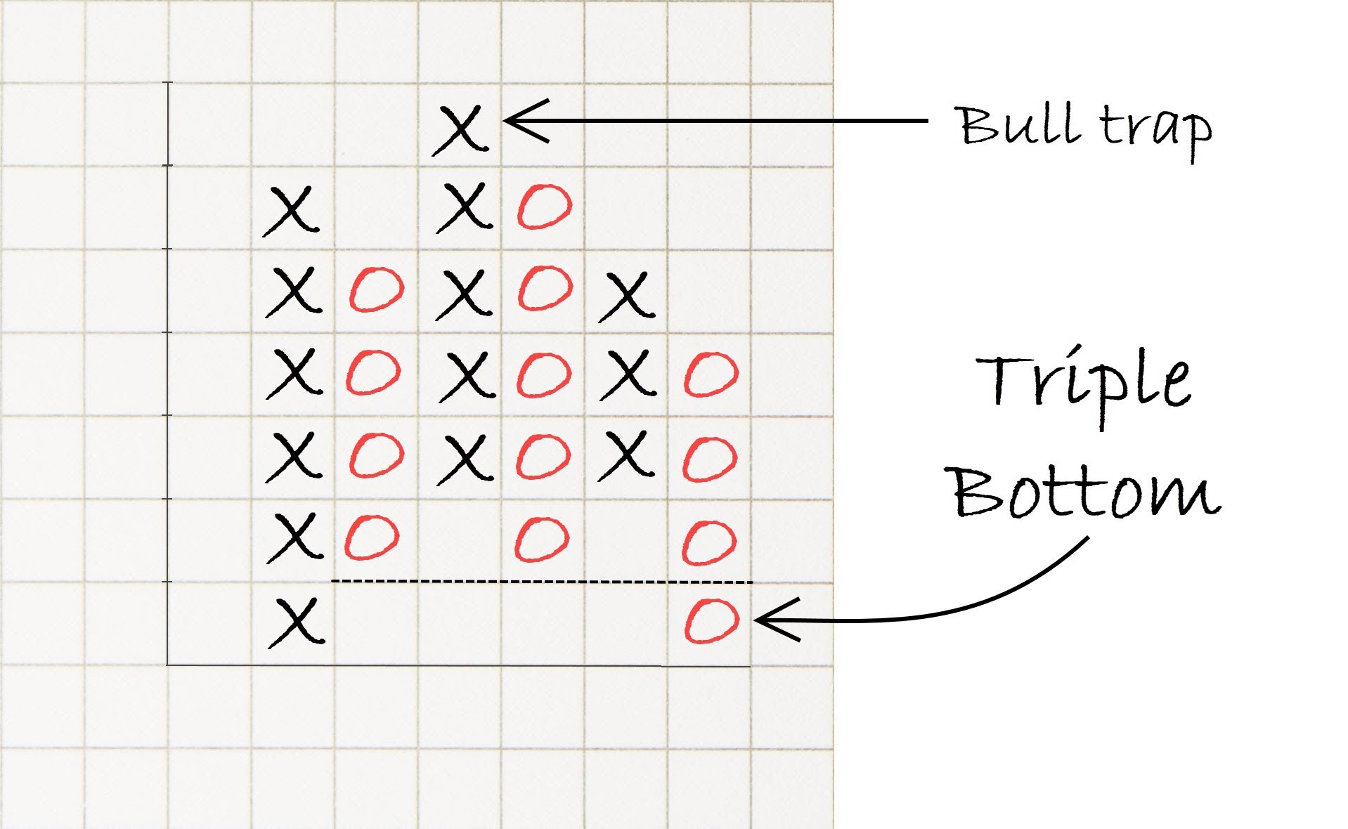
- Triple Top
- Triple Bottom
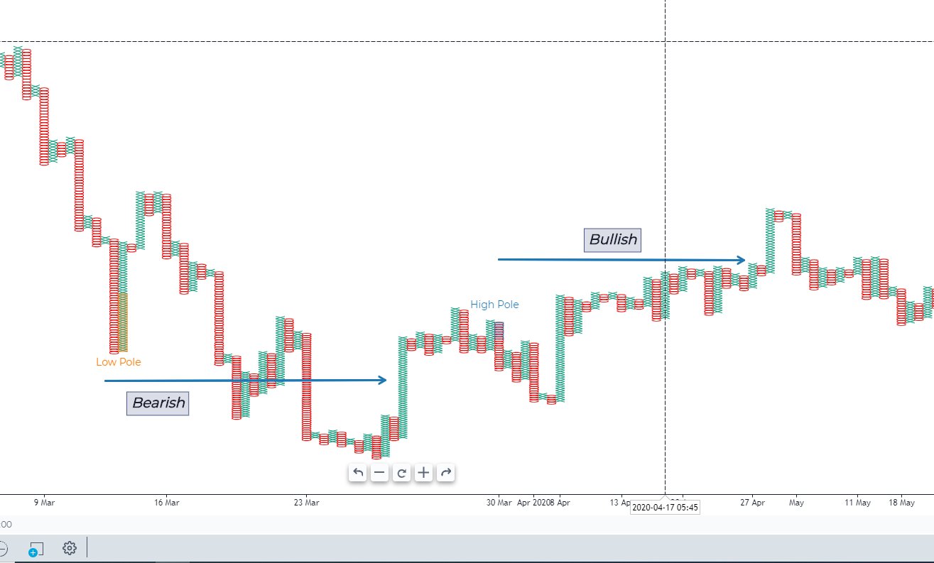
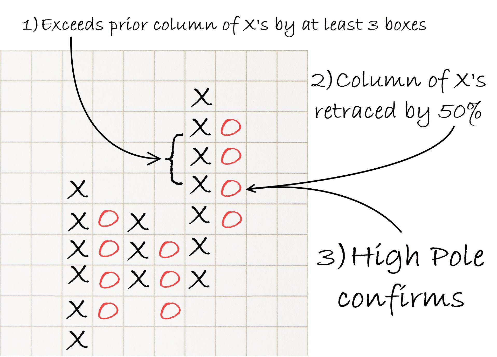
- High Pole
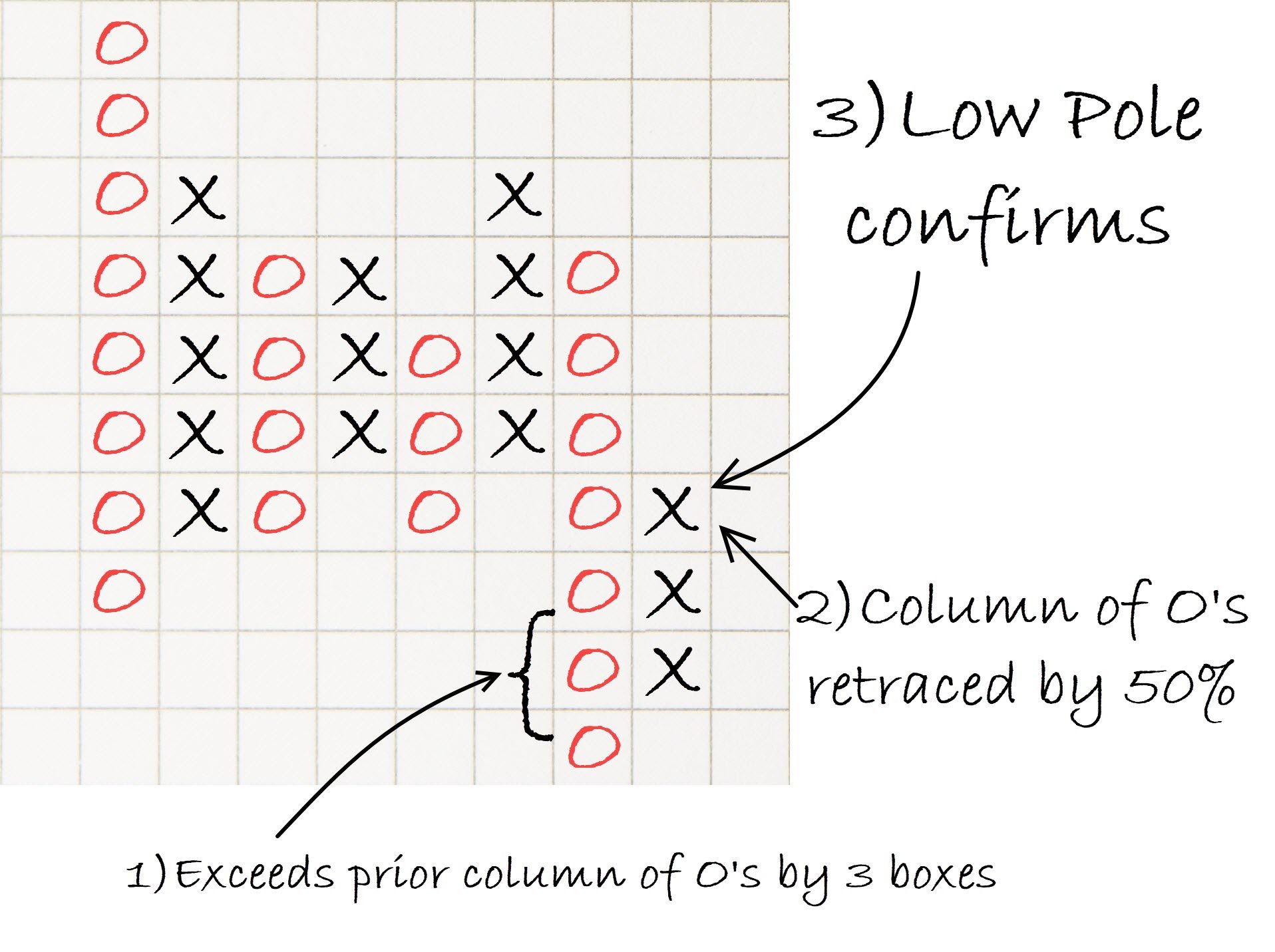
- Low Pole
- Significant Column
PnF Patterns
Bullish Double Top and Bottom
Triplle Top and Bottom
High Pole and Low Pole
